Table of contents
- Overview
- Our Approach
- Developer Guide
- User Guide
- Deployment
- Current State of Project
- Community Feedback
- M1 Project Page
- M2 Project Page
- M3 Project Page
- Our Team
- Team Contract Google Doc
Overview
The problem
Many UH computer science and engineering students want to learn about internship and job opportunities, but currently they must wait until a company decides to visit the campus or send out some sort of announcement. There is no efficient way for students to understand the “landscape” of internship and job opportunities that might be available in the future, so they can prepare for them now.
The solution
The Company Connector web application provides a new way for local and non-local companies who want to recruit students from UH to make their (potential) opportunities known to students. At the same time, students can create profiles on the site with their interests, experiences, and more. The site can match students to potential employers and vice-versa.
Our Approach
Instead of sending out announcements each year, a company can create a page in the site that lists:
- A brief overview of the company.
- Geographic location of the company.
- A list of positions that they commonly recruit for from new UH graduates. Each position has a brief description, a set of skills, whether it’s an internship, permanent position, or both, how many people they would like to hire, and salary range.
- Links to the company’s main website for additional information.
- Contact email(s)/text messages for followup.
- Students who visit the site can create a profile with their interests (skills), preferred geographic location, and link to their professional portfolio page.
Admins can monitor the site for inappropriate content and create new categories of skills and geographic locations.
Developer’s Guide
Backend System
This application was built on meteor-application-template-react. For information regarding this template, please refer to https://ics-software-engineering.github.io/meteor-application-template-react/
Installation
First, install Meteor.
Second, download a copy of Job Match’UH.
Third, go to your newly created repository, and click the “Clone or download” button to download your new GitHub repo to your local file system. Using GitHub Desktop is a great choice if you use MacOS or Windows.
Fourth, cd into the app/ directory of your local copy of the repo, and install third party libraries with:
$ meteor npm install
Running the system
Once the libraries are installed, you can run the application by invoking the “start” script in the package.json file:
$ meteor npm run start
The first time you run the app, it will create some default users and data. Here is the output:
meteor npm run start

> meteor-application-template-react@ start C:\Users\gaila\github\gailag\WOD\source\app
> meteor --no-release-check --exclude-archs web.browser.legacy,web.cordova --settings ../config/settings.development.json

[[[[[ C:\Users\gaila\github\gailag\WOD\source\app ]]]]]

=> Started proxy.
=> Started MongoDB.
I20220510-20:21:21.163(-10)? Creating the default user(s)
I20220510-20:21:21.174(-10)?   Creating user admin@foo.com.
I20220510-20:21:21.175(-10)?   admin@foo.com : admin
...
=> Started your app.

=> App running at: http://localhost:3000/
Note regarding “bcrypt warning”:
You might also get the following message when you run this application:
Note: you are using a pure-JavaScript implementation of bcrypt.
While this implementation will work correctly, it is known to be
approximately three times slower than the native implementation.
In order to use the native implementation instead, run

  meteor npm install --save bcrypt

in the root directory of your application.
On some operating systems (particularly Windows), installing bcrypt is much more difficult than implied by the above message. Bcrypt is only used in Meteor for password checking, so the performance implications are negligible until your site has very high traffic. You can safely ignore this warning without any problems during initial stages of development.
Note regarding “MongoError: not master and slaveOk=false”:
Intermittently, you may see the following error message in the console when the system starts up:
MongoError: not master and slaveOk=false
     at queryCallback (/Users/philipjohnson/.meteor/packages/npm-mongo/.3.1.1.1mmptof.qcqo++os+web.browser+web.browser.legacy+web.cordova/npm/node_modules/mongodb-core/lib/cursor.js:248:25)
     at /Users/philipjohnson/.meteor/packages/npm-mongo/.3.1.1.1mmptof.qcqo++os+web.browser+web.browser.legacy+web.cordova/npm/node_modules/mongodb-core/lib/connection/pool.js:532:18
     at _combinedTickCallback (internal/process/next_tick.js:131:7)
     at process._tickDomainCallback (internal/process/next_tick.js:218:9)
While irritating, this message appears to be harmless and possibly related to a race condition between the development instance of Mongo and Meteor. By harmless, I mean that in most cases, the console goes on to display App running at: http://localhost:3000/ and no problems occur during run time.
Viewing the running app
If all goes well, the template application will appear at http://localhost:3000. You can login using the credentials in settings.development.json, or else register a new account.
ESLint
You can verify that the code obeys our coding standards by running ESLint over the code in the imports/ directory with:
meteor npm run lint
User Guide
These are the mockup pages that will be used for the final project.
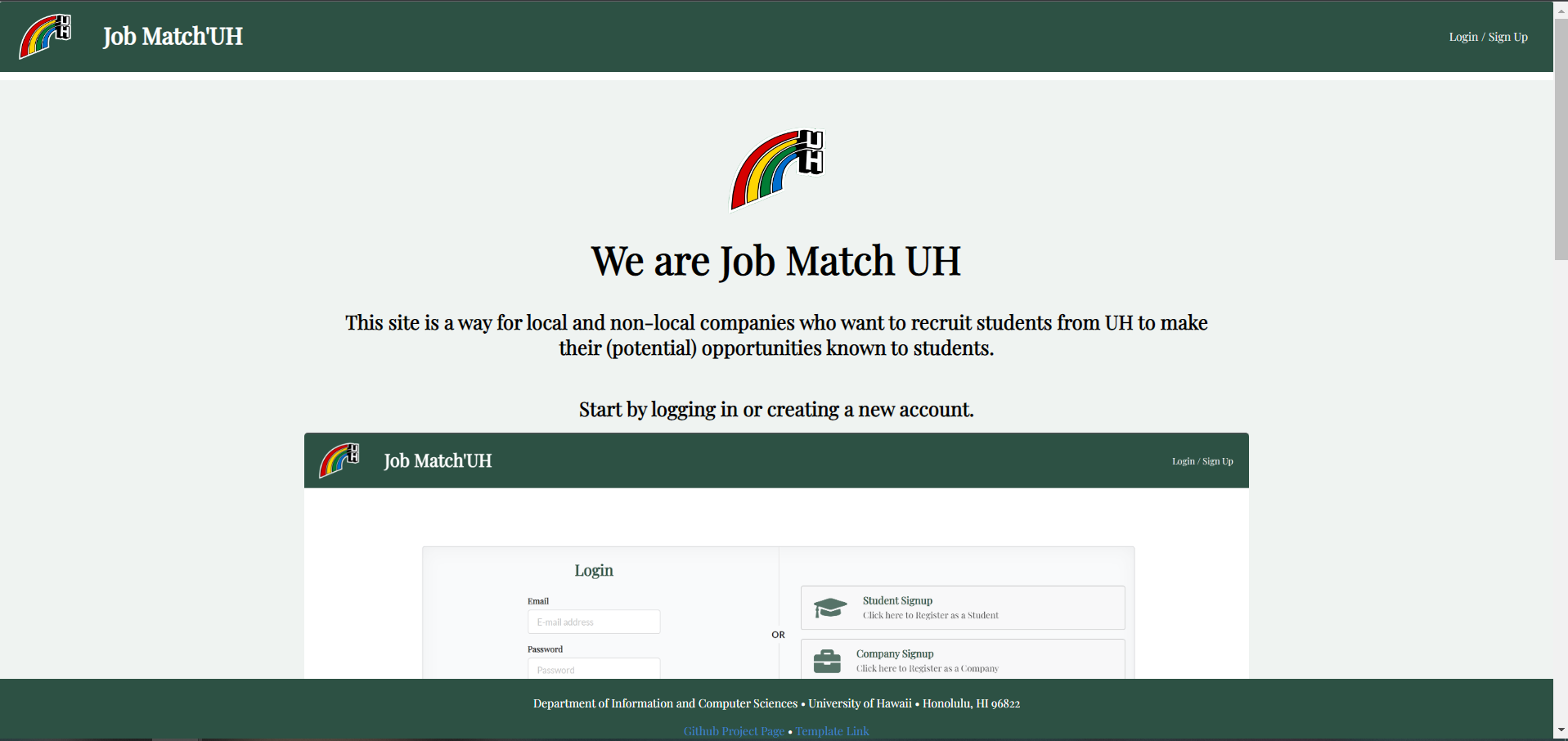
Landing Page
The landing page is presented to users when they visit the top-level URL to the site.
Upon entering the site, users can:
- Login or Sign Up
- Read an About Us
Mockup: 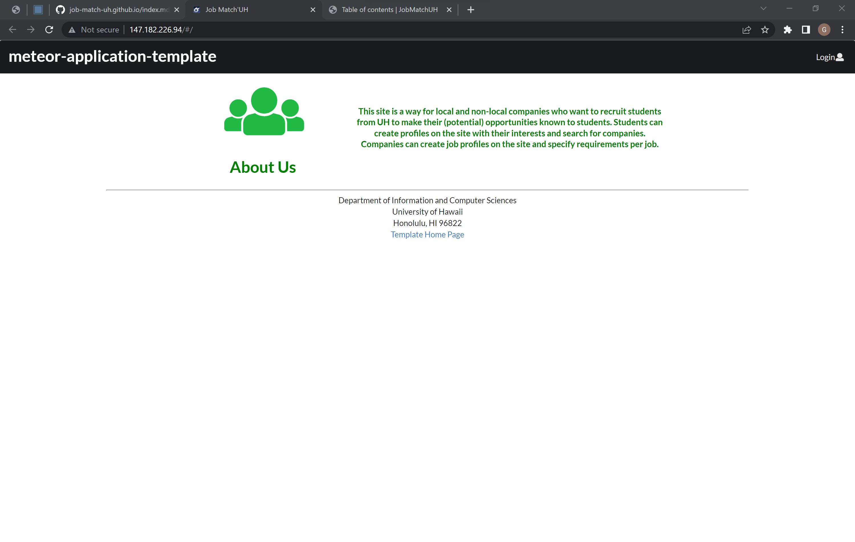
Sign in / Sign up Page
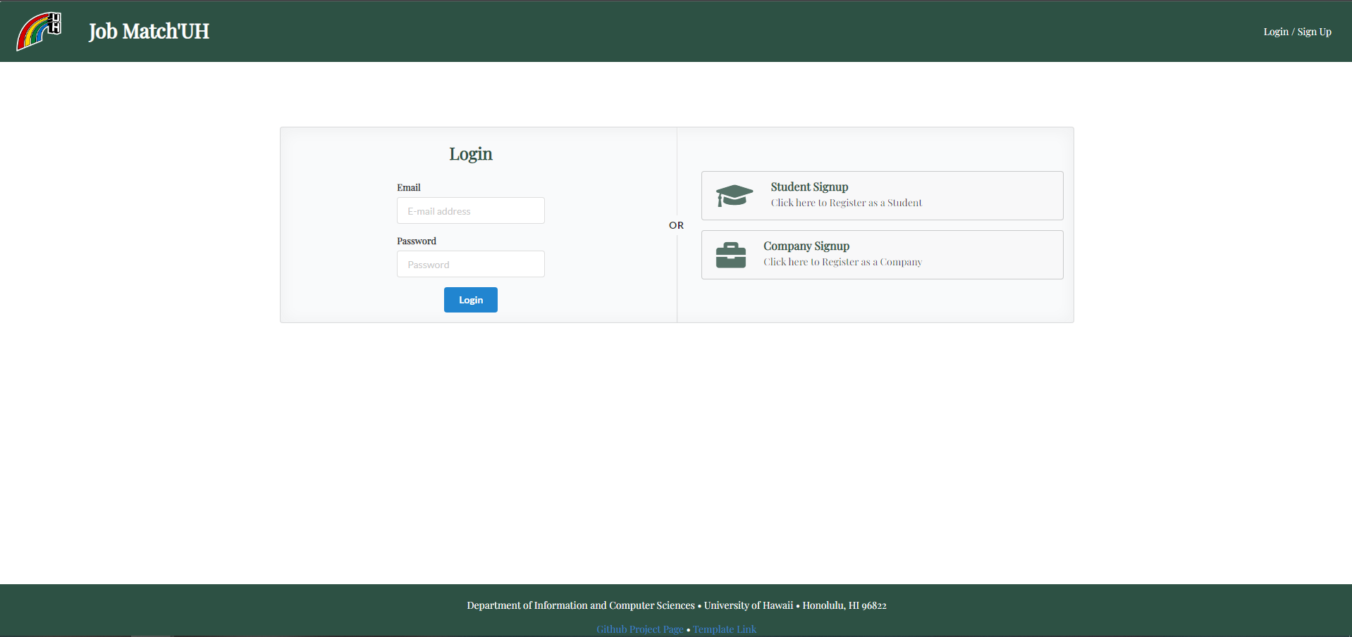
This is what the sign in page will look like. There will be two cards for student log in and company log in. If they do not have an account they can register one below in a redirected link.
Mockup: 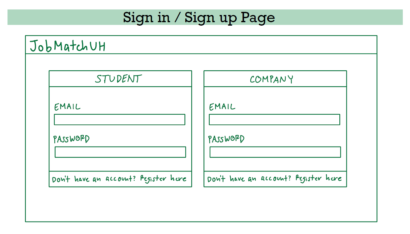
Create Student Profile Page
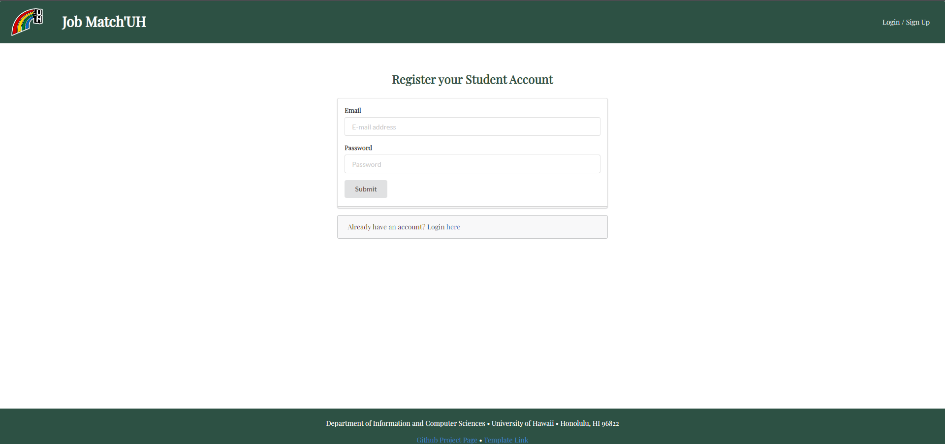
New student users need to register a student account. New users need to finish creating certain aspects of their account before gaining access to the entire site and companies.
Mockup: 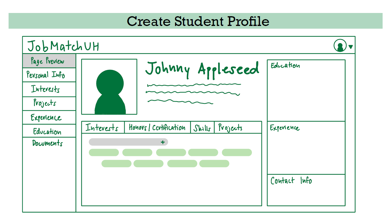
Create Company Profile Page
New company users need to register a company account. New users need to finish creating certain aspects of their account before gaining access to the entire site and companies.
Mockup: 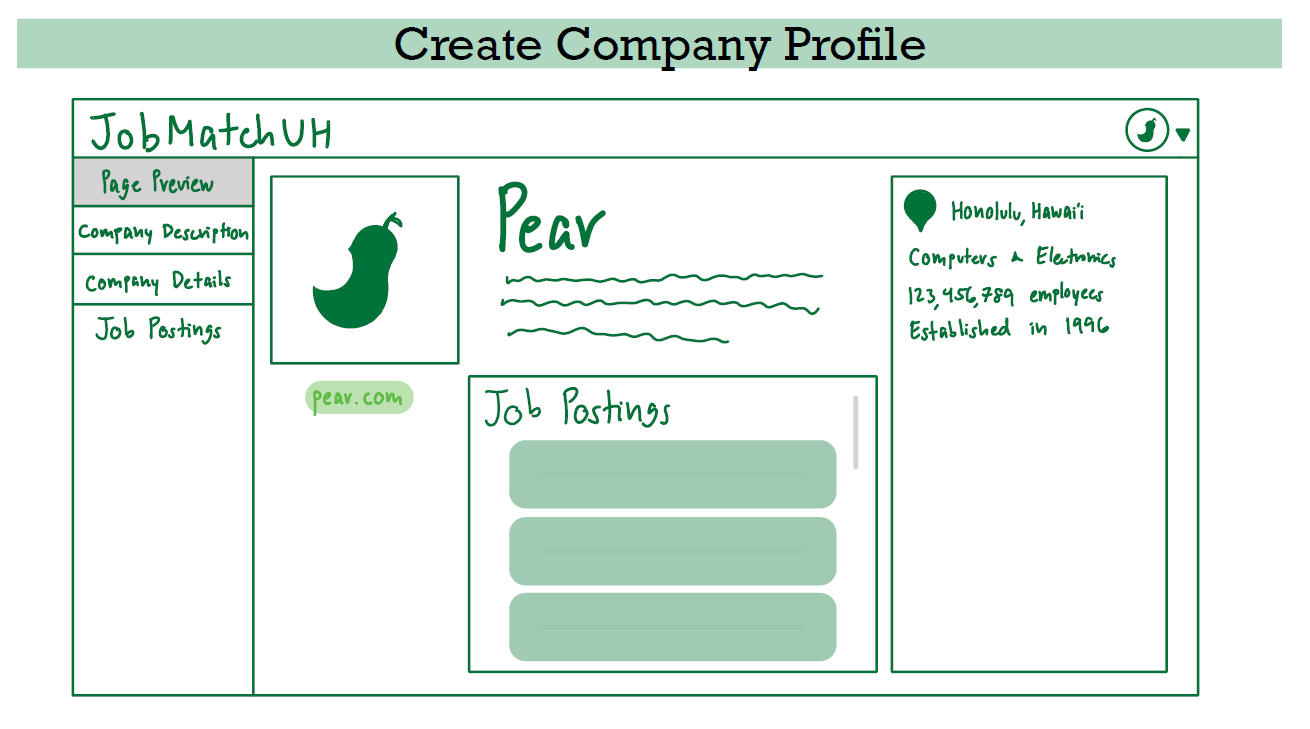
Student home page
The student home page suggests companies that are hiring according to their desired interests.
Mockup: 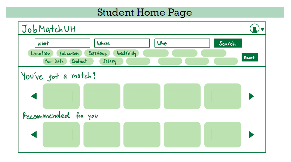
Company home page
The company home page lists all the students whose interests, experience, and skills match their company’s needs. The page will be organized by job position and have the option to filter the group of students who matched the job description.
Mockup: 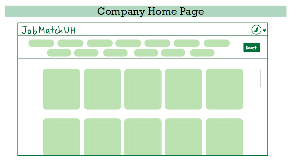
Admin home page
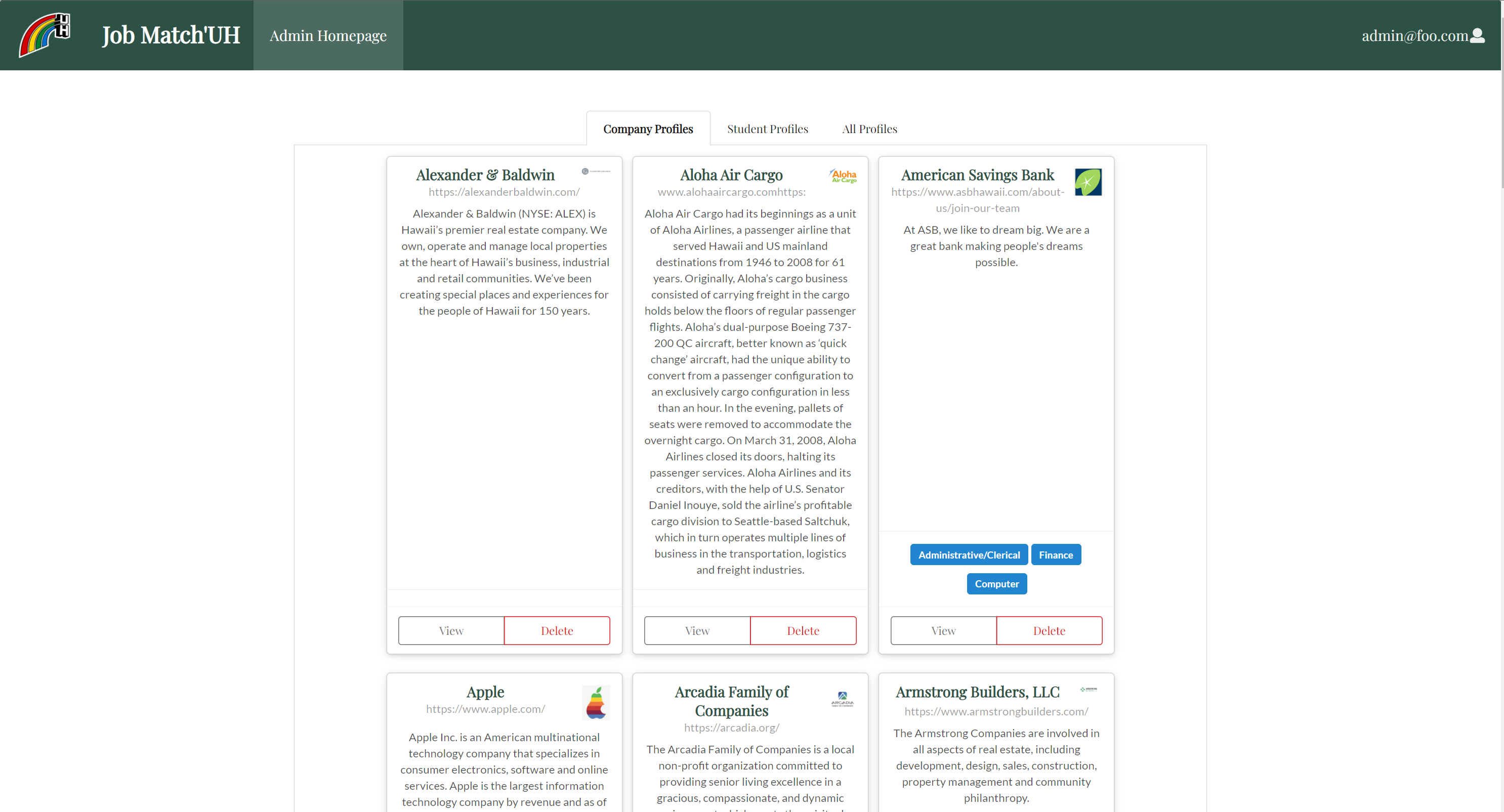
Edit feature to control profiles and/or delete any “false” profiles or violating profiles.
Mockup: 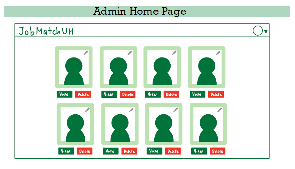
Student profile page (Projects, Profiles, Interests)
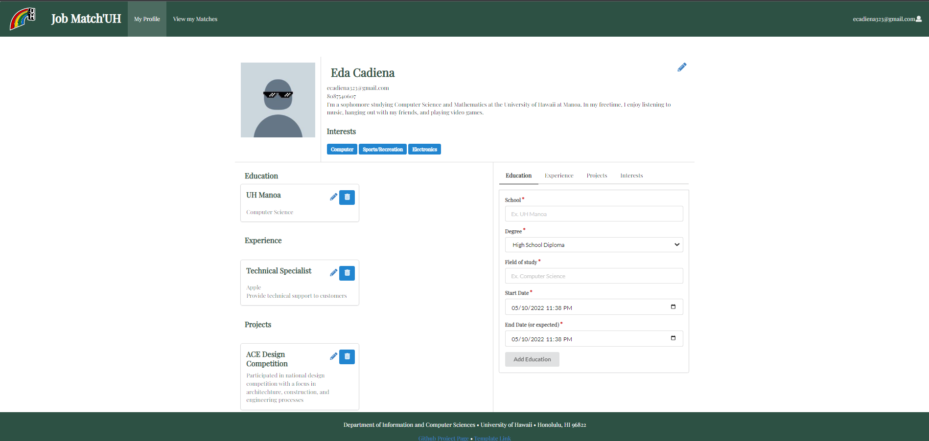
The Student profile page showcases a student’s interests, prior/current experience, and more. On this page, signed in students can edit and add to their profile.
Mockup: 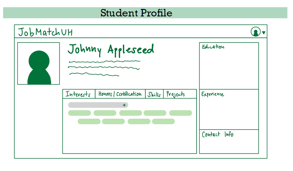
Company profile
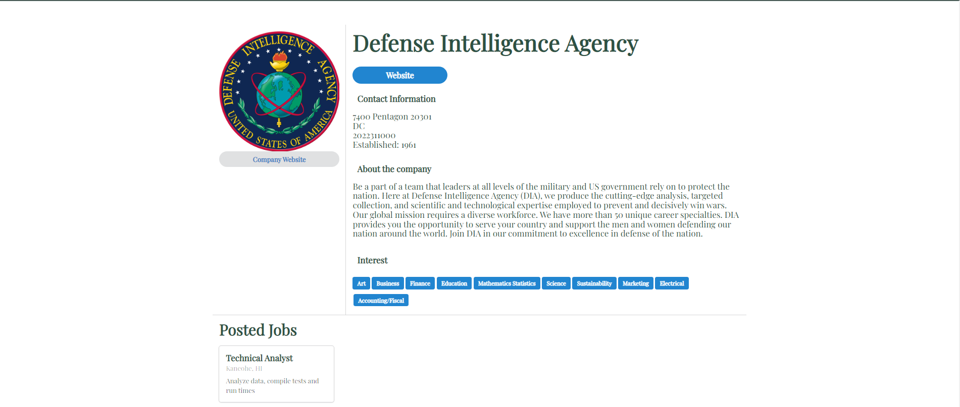
The Company profile page allows companies to talk about their organization, post jobs, and more. Company administrators can add to their job section, edit their description, etc.
Mockup: 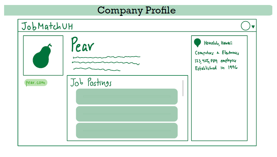
Deployment
Current State of Project
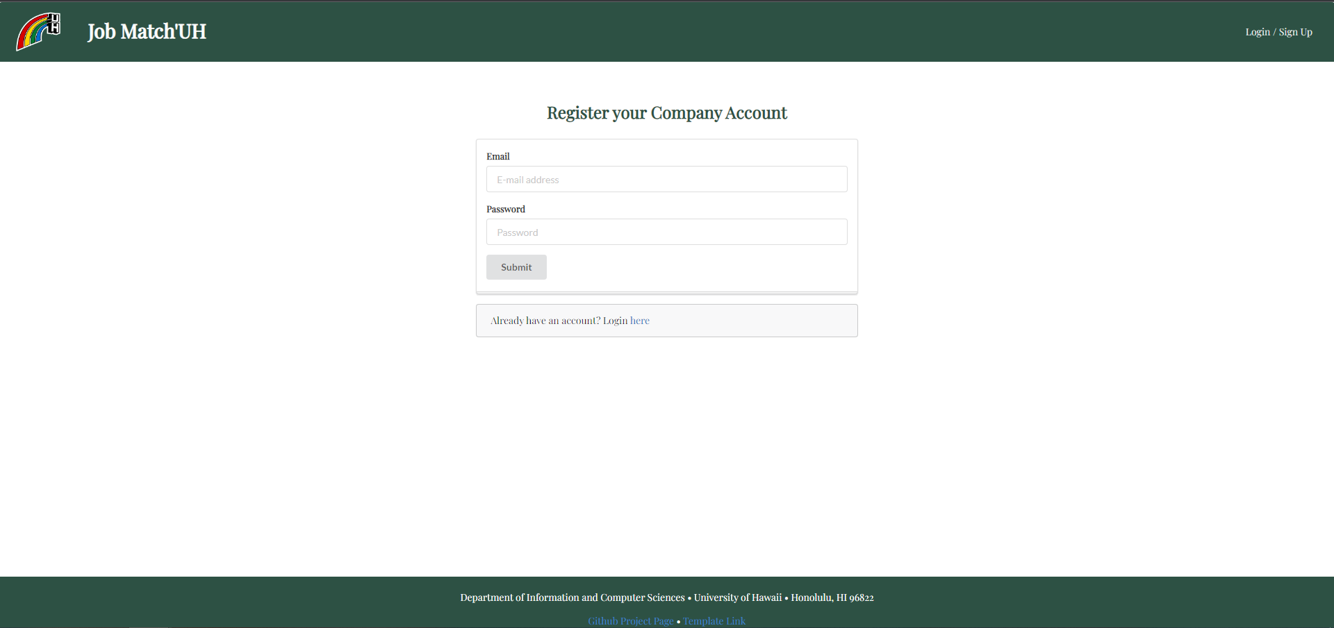
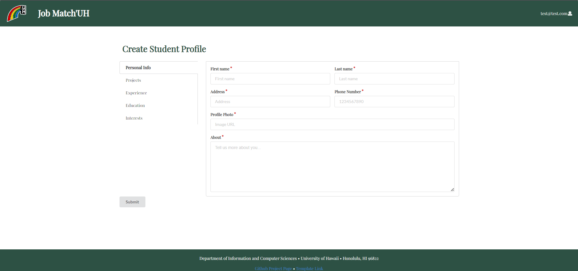
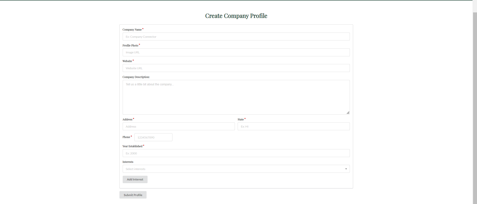
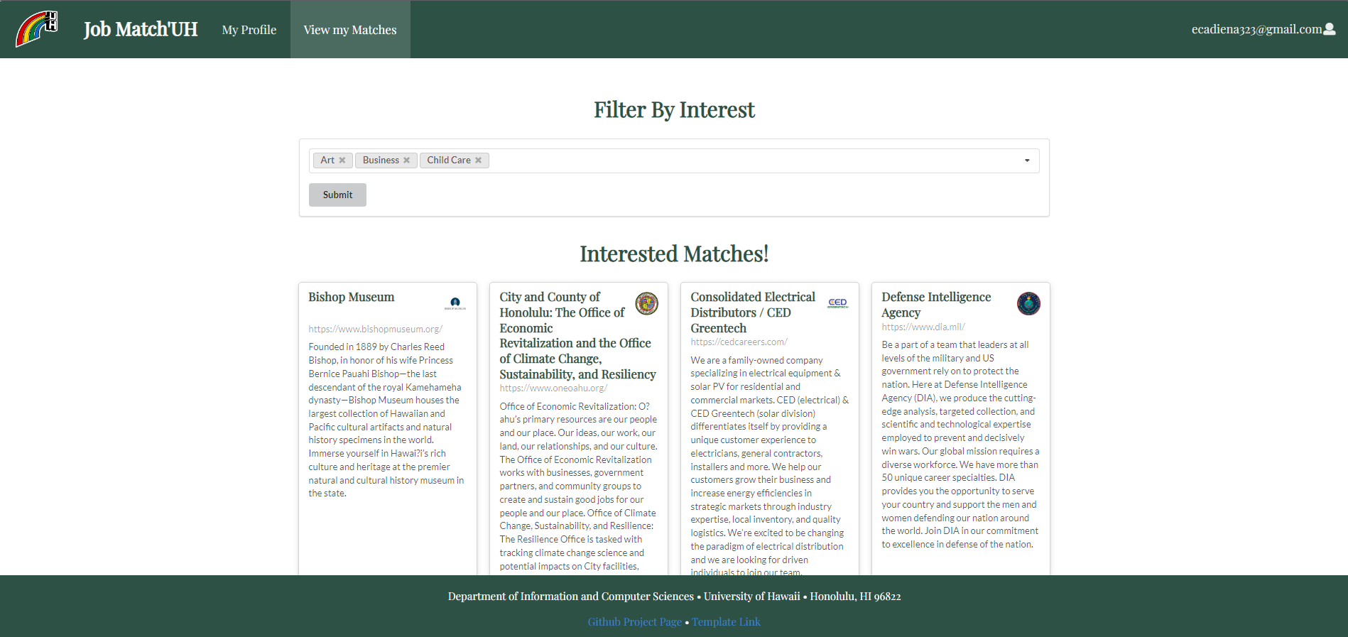
This is the final version of Job Match’UH. We focused on implementing functionality so that users can login, create an account according to their role (student or company), and matching students to compnies using interest filtering. Further styling details were implemented as much as possible to make the app more user friendly.
Landing Page
Sign in / Sign up Page
Register Student Account Page
Register Company Account Page
Create Student Profile
Create Company Profile
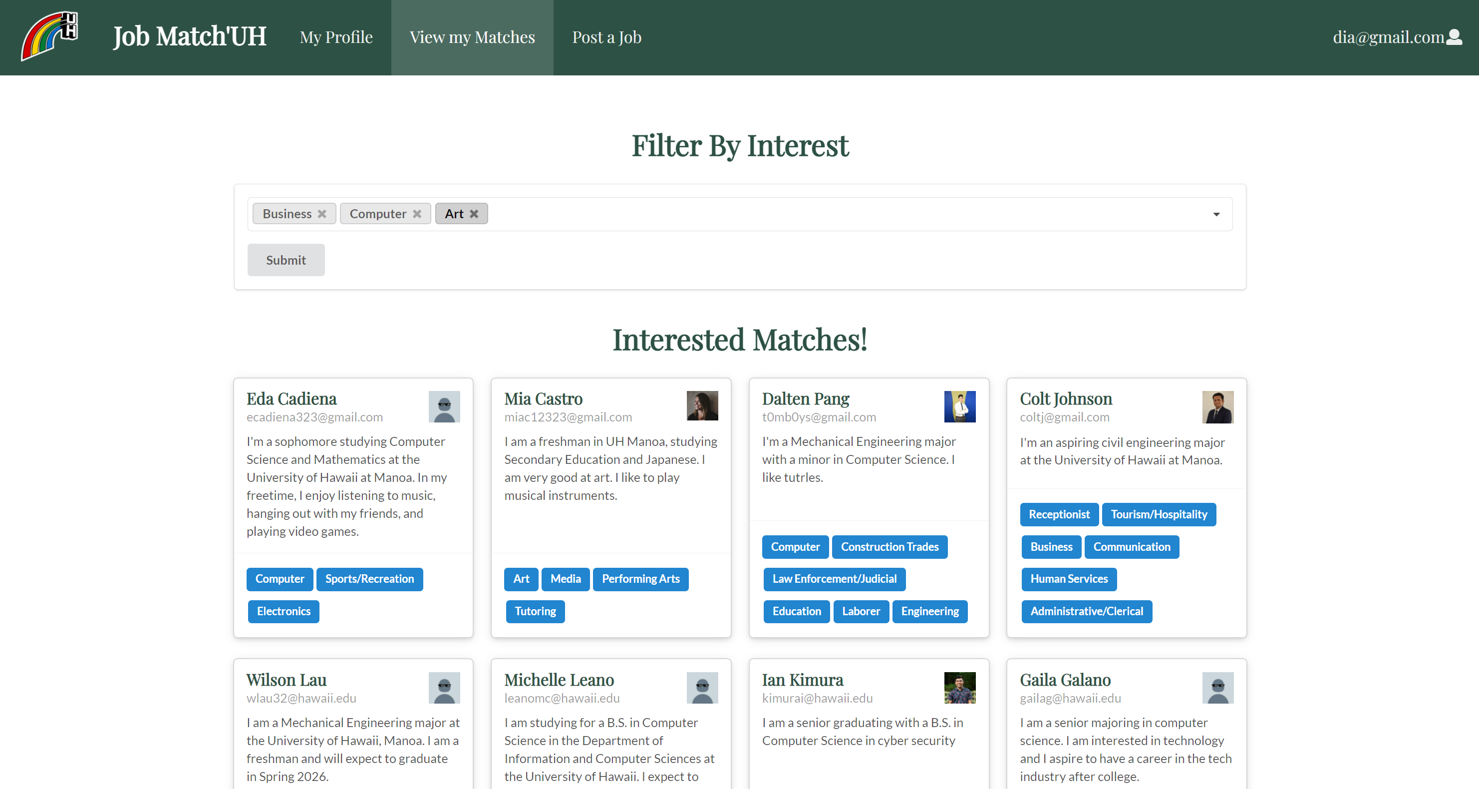
Student Home Page
Company Home Page
Admin home page
Student Profile
Company Profile
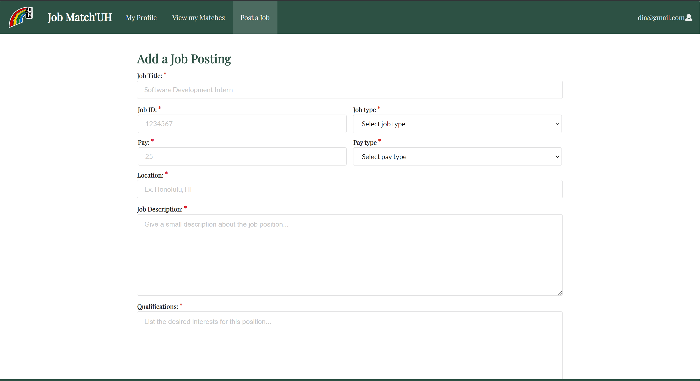
Job Posting page
Community Feedback
We asked five UH community members for their opinions on our app. Here’s what they had to say:
Leititia Le, Pre-Pharmaceutical said,
“The app’s font is basic. Visually, the design could use more pictures, more color, and more styling. The signup process felt incomplete and was not user friendly. Could not find the edit page without some help. For the profile you could include additional options such as skills and accolades. A job search bar at the top of the page might be a nice inclusion to search for specific companies or locations with the ability to filter differences between each. Also an inbox/messages area where you can send & receive drafts would be a nice touch.”
Alysha Leano, Information Security and Assurance, said,
“I like this app. It did its job in matching the user to job suggestions so that in it of itself is a success. The program ask for a sufficient amount of information from the user in order to match them properly to potential employees. Everything but the interests seem a bit “unnecessary” in this elementary step of matching strictly to interests however. What is the rest of my information used for? Additionally, I personally like to work on smaller windows so I suggest making it more user friendly in that way. Resizing to a smaller window moved objects out of their spot or put them in a position that made them blocked by the footer. I think it’d also be helpful to include having a return button from search/edit. I have to use the back button in my browser to return to the previous which is kind of inconvenient. Adding on to that, I think it would be helpful that the site caches what the last searched interest was when returning from looking at companies/job positions. That way I won’t have to reclick my all my interests again. Or, the application can take the interests I’ve already inputted on my personal info and do an “apply my interests” type of checkbox/button.”
Dylan Kira, Psychology major, said,
- *First impression: nice and not overwhelming
- *Maybe use a different font – go for a cleaner look since your website is going for a simple theme
- *Regarding the required field for the project section: it’s nice to put a project to showcase your skills but everyone may not have one
- *My Profile section: layout looks cool, especially the bottom-right section where you can edit your information
- *Was confused when I had to put my interest again under the View My Matches when I already did so when I created my profile
- *Company’s contact info: a hyperlink that directs you to the company’s email would be a nice feature
Dalten Pang, Mechanical Engineering and Computer Science, said,
“The website works for the most part, with some minor hiccups here and there. The main thing was some of the tags breaking the website, from both account types - company and individual. An example is the Art tag when searching from the company perspective broke the website. With tags there was also the possibility to have duplicate interest tags if the same tags are added at separate times. There’s also the minor inconvenience that the website logs you out after creating your profile, you’d ideally be put into the main page.
Some small UI gripes including the misalignment of descriptions and headers in the about company page. The website of the companies leaves a gap between the name of the company and the website when searching from the Individual’s perspective. The website link also sometimes sticks outside the container, as with Grace Pacific LCC. When adding phone numbers it would be a nice thing if it auto formatted.
Overall the website is nice and simple. Could’ve been in Comic Sans”
Ian Kimura, Computer Science, said,
“The web app is easy to navigate and simple, which makes some of the accent details pop out, like the logo and the green border theme. The style is minimalist so it makes the whole thing appear clean and sleek, although style wise it might not appeal to the target audience which is to the UH community of college students as it could appear kind of boring. The home page is a nice touch, with a screenshot tutorial of how to use the page for first time users. It makes the intent of the website very clear. The only thing I would change is to have a home screen rather than the “how to” page. Maybe show a quick thing about you, recent matches, and then give the how to page its own tab since returning users are not going to want to see the how to every single time they open the site or log in.The website is also easy to navigate with it being only two tabs, and the layout of the profiles is nice. I like the feature of being able to edit on the same page and have a live update on the profile. The interests and matching page is self explanatory, and the company profile has all the essential information a student would want out of a community company. I think a nice feature to add for improvement would be to filter by job listing or by date of posted job listing, since you could match with a company but not have a job open in the field you are interested in. Or adding a chat feature with the company that you match with. The site seems to work well and is able to generate matches as said.”
M1 Project Page
Click on this link here to view our Milestone 1 (M1) Project Page. This shows the issues that were completed for the milestone at this time.
M2 Project Page
Click on this link here to view our Milestone 2 (M2) Project Page. This shows the issues that were completed for the milestone at this time.
M3 Project Page
Click on this link here to view out Milestone 3 (M3) Project Page. This shows the issues taht were completed for the milestone at this time.
Our Team
Company Connector is designed and implemented by Michelle Leano, Eda Cadiena, Cameron Arakaki, Gaila Galano, Larissa Tsai.